By: ankita kulkarni
March 28 2022
Maps are misinformation
Share Article:


Innumerable media outlets covering the ongoing invasion of Ukraine have posted maps depicting the "progress" of the Russians. These red splotches represent areas under Russian control, the BBC says. These stripes indicate the 2014 annexation of Crimea, the New York Times says. According to the Guardian, these black arrows point to the never-ending onward march of the soldiers Moscow sent.
While these maps certainly show some of the truth, they only show some of the truth. As the historian Mateusz Fafinski wrote for Foreign Policy, such maps can grossly overestimate Russian control of Ukraine. And given that they leave out the nuances of an ongoing war, their omnipresence is problematic. They may even inadvertently project the idea that Russia is winning — a narrative Putin might quite like.
In short, the maps mislead, distort, twist, and lie.
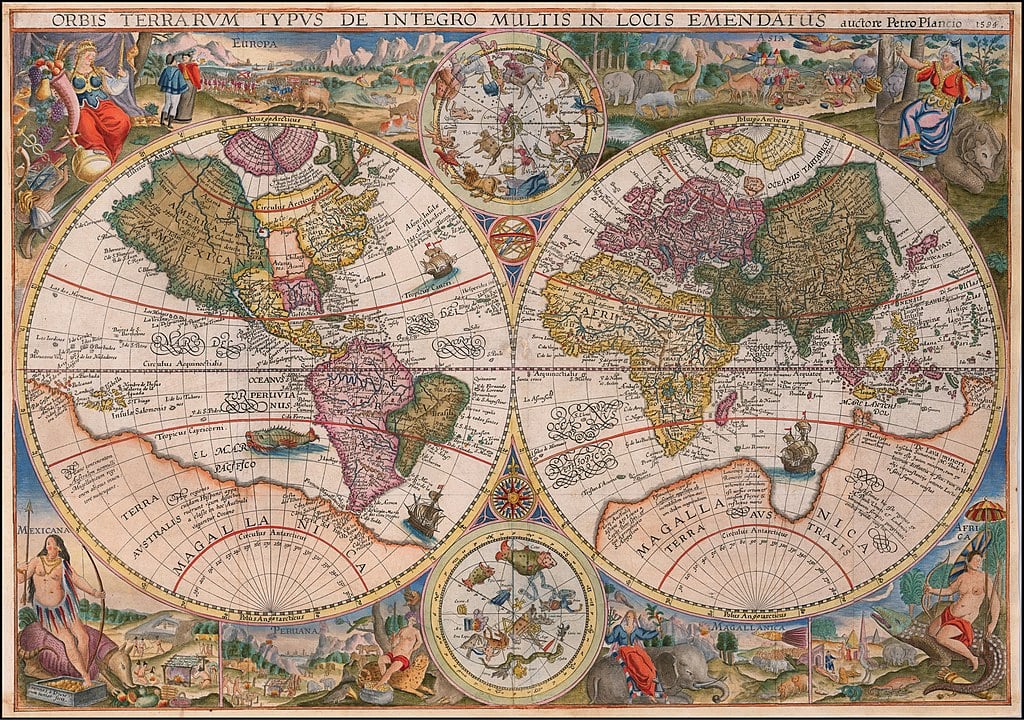
Despite their authoritative air, maps have always distorted the truth. This is because you can't turn an oblate spheroid — the shape of the Earth — into something that's flat. It just doesn't work. If you try, there will be tears, and there will be distortions.
I asked Vidit Nanda, associate professor of mathematics at Oxford University, why you can’t simply take a round thing and make it flat without distortion.
“Spheres have strictly positive curvature, while flat things have zero curvature,” he says, after attempting to explain the concept of curvature to me. “This means it’s impossible to turn a globe into a 2D map that preserves distances and areas.”
A simple example: on a flat plane, if you walk straight down the street for a block, take a right, walk straight down another block, take another right, and walk a block – you’ll be one block north of where you started. If you do this on a curved plane, and go a long enough distance, you’ll end up exactly where you started. Your path is a giant triangle.
Mercator
The Mercator Projection is perhaps the most common map of the world. Because it's a cylindrical projection, it relies heavily on size inflation. In Mercator's case, this means the further away from the equator you go, the bigger landmasses look. Alaska and Greenland look huge on the Mercator; they seem to dwarf places they are actually much smaller than. In real life, Indonesia is wider than continental Europe. As for the Pacific Ocean, it's so huge it contains its own antipodes, and yet, shoved on the edges as it is on the Mercator, it doesn't look like that at all.

The Mercator Projection is perhaps the most familiar world map.
Some people say Mercator’s size inflation is Western-centric, racist, and colonial. These people have a point. Save for Antarctica, where no one permanently lives, the countries that look disproportionately larger are the former colonial powers of Europe and North America.
Also, the original Mercator Projection was literally made by colonial man. Gerardus Mercator was a sixteenth-century Flemish cartographer who wanted to create a map specifically for navigating colonial trading routes. The Mercator Projection is good for this. Unlike other maps, on the Mercator Projection, North is up, South is down, East is right, and West is left.
And it turns out the Mercator Projection is good for navigation even if you aren't a colonial sailor traversing the Atlantic. If you're simply a pedestrian looking for the nearest ATM, or the driver of a vehicle looking for your final destination, then the Mercator also works. This is because the Mercator is a conformal map — it preserves angles — which is pretty useful when you need to make a U-turn if possible. This feature is exactly why Google, Apple, and Bing Maps use a Mercator Projection.
Gall-Peters

The Gall-Peters Projection sacrifices shape for size.
The Gall-Peters Projection (depicted above) is often touted as a solution to the Mercator. It is an equal-area cylindrical projection, meaning it's all about relative size. Mercator-haters tend to be pleased by it; Africa is reassuringly large, Russia is reassuringly squooshed, and it's perfectly useless for colonial navigation.
If the Gall-Peters is the only world map you have laid your eyes on, you would have a more accurate idea of the size of landmasses such as Africa and South America. However, you wouldn't have a more accurate idea of the shape of Africa and South America, because that's where the compromise lies. Towards the poles, countries are stretched horizontally. Towards the equator, countries are stretched vertically. If you have never seen the Gall-Peters Projection, it can look a bit whoa.
It's arguable whether such shape distortion matters much, especially when it comes to education. Back in 2017, Boston schools decided it didn't and opted for the Gall-Peters Projection over the Mercator Projection. Of course, the Gall-Peters Projection is not really more accurate than the Mercator Projection — all maps mislead — but its inaccuracies might be more appropriate in schools that choose to decolonize the curriculum.
Borderlands
Projections are one thing, and borders are another.
If you access Google Maps from countries other than Russia, the Crimean Peninsula is separated from Ukraine with a dashed line indicating that it is a "disputed territory." If you are in Russia, however, the Crimean Peninsula has a straight line across it because, according to the Kremlin narrative, there is nothing disputed about the status of Crimea: it is part of Russia. (That said, most Russians would use Yandex maps to look at the world. As Yandex is a Russian company, it undisputedly shows off Russia’s annexations as uncontested.)

This is how Google Maps shows Crimea when accessed from outside Russia. The dashed line indicates a disputed territory.

This is how Google Maps shows Crimea when accessed from inside Russia. The straight line indicates an undisputed territory.
Interestingly, Apple Maps changed its Crimean-map-based tune recently. Before early March, when accessed from countries outside of Russia, Apple Maps did not show a label for Crimea; it sort of just showed the peninsula as a nowhere land. After early March, however, it started labelling the peninsula as being part of Ukraine.
***
There is something definitive about maps. Neutral-seeming. They show you what the world looks like, where you are now, where you need to go.
But maps are purpose-built – they are only good for what they're good for. They have to pick what to distort and what to represent. If you want to travel from Glasgow to Galway, do not consult a map of the London Underground. If you want to find your way around a stately home, then don't use Google Maps. And if you want your worldview to be accurate when it comes to the size and shape of landmasses, distance, and direction, then for the love of God, get yourself a globe.
Globes are great. You can spend hours spinning them around and around and they are handsome too. Ideally, it would even be a globe without borders depicted — that would remove any talk of any disputed territory. After all, borders are artificial and as ephemeral as we are. Though it might still give you the wrong idea that the earth is a perfect sphere.