By: Annet Preethi Furtado
July 19 2022
False: The new weather forecast map from the Met Office is intended to cause panic about climate change.
Share Article:


Fact-Check
The Verdict False
Two distinct and unrelated map patterns have been shared. The Met Office changed its graphics for weather for accessibility and accuracy.
Claim ID 740397c6
Context:
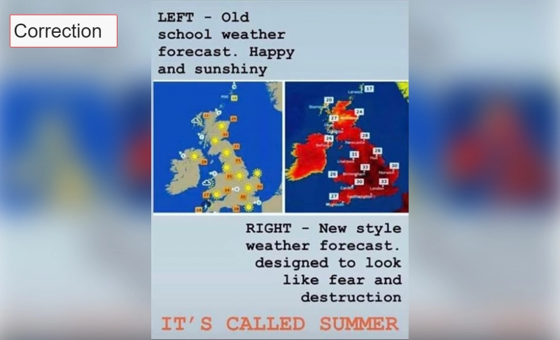
The U.K. Meteorological Office, also known as the Met Office, issued the first-ever extreme heat warning in July 2022 because temperatures were expected to reach 40 degrees Celcius for the first time in the U.K. In light of the forecast, a post comparing an old weather forecast to a new one has gone viral on social media. The photo collage illustrates a similar high-temperature forecast for the U.K., one of a simple weather forecast map and the other with a heat map with bold colors.
The one on the right has a more distinctive color pattern than the older one on the left. It is colored in bright shades of red and black, and the caption of the Facebook post claims that it was designed that way to promote ''fear and destruction.'' The caption within the image says, ''Left – old school weather forecast, happy and sunshiny. Right – new style weather forecast, Designed to look like fear and destruction. It's called summer.''
The post implies that the Met Office is trying to spread the misconception that these temperatures pose a more significant threat. However, considering the effects of climate change that have increased by the numerous catastrophic weather events worldwide, the views expressed in the post are wrong. Furthermore, the photo on the right, which purports to be a current prediction, is an old forecast from 2016.
In fact:
Through a reverse image search, we found that the viral image's correct forecast is a Met Office forecast from 2016. In July 2016, the Met Office issued a forecast for Tuesday, July 19, 2016, stating, "Tomorrow sees the peak of the #heat with highs of 34 °C!." Therefore, contrary to the post's claim, the forecast is not recent.
Aidan McGivern, a meteorologist at the Met Office who developed the Met Office's temperature color system, said via Twitter that there had been a ''graphics redesign'' earlier in 2022 that changed the map view, temperature symbols, and color scale.
The new design improved visibility for persons who are color blind rather than intimidating people about the weather. He explained, "Unfortunately, the old scale (which used a mixture of blues, greens, oranges, and reds) wasn't accessible for people like me who are colorblind. So, we changed the temperature colors to make the maps easier for people who are colorblind like me.''
Furthermore, the viral posts incorrectly claimed a transition from previous forecasts with sunny maps to the current style with dark red colored patterns that aim to instill fear. This map transition assertion is also unfounded because we recently came across a Met Office weather forecast for July 2022 that used the sunny map. While the department occasionally posts bright and sunny maps, McGivern claims that data-driven graphics are often used instead of weather symbols.
Logically reached out to McGivern for comment, and he clarified that he has provided an update via his Twitter thread that the second image was not doctored. His new update via Twitter read, "I've now been told that in July 2016, the Met Office tweeted a map that looks like the image on the right in the side-by-side pic. I was unaware of this tweet. It appears to be a one-off, and the temperatures and color scale combination doesn't match what we've used since." He had previously noted that the image was doctored.
The verdict:
In the side-by-side viral photo, an old map from 2016 is shown alongside the assertion that the most recent Met Office forecasts are meant to instill fear. The maps’ colors were redesigned for accessibility and accuracy, not to fearmonger. Further, the simple map with the sunshine symbols is still being used. Therefore, we have marked this claim as false.
Correction: The previous version of this fact-check noted that one of the images in the Facebook post was doctored, based on Mr. McGivern's Twitter post. However, we have clarified it with him and corrected this fact-check, and updated the information for clarity.

